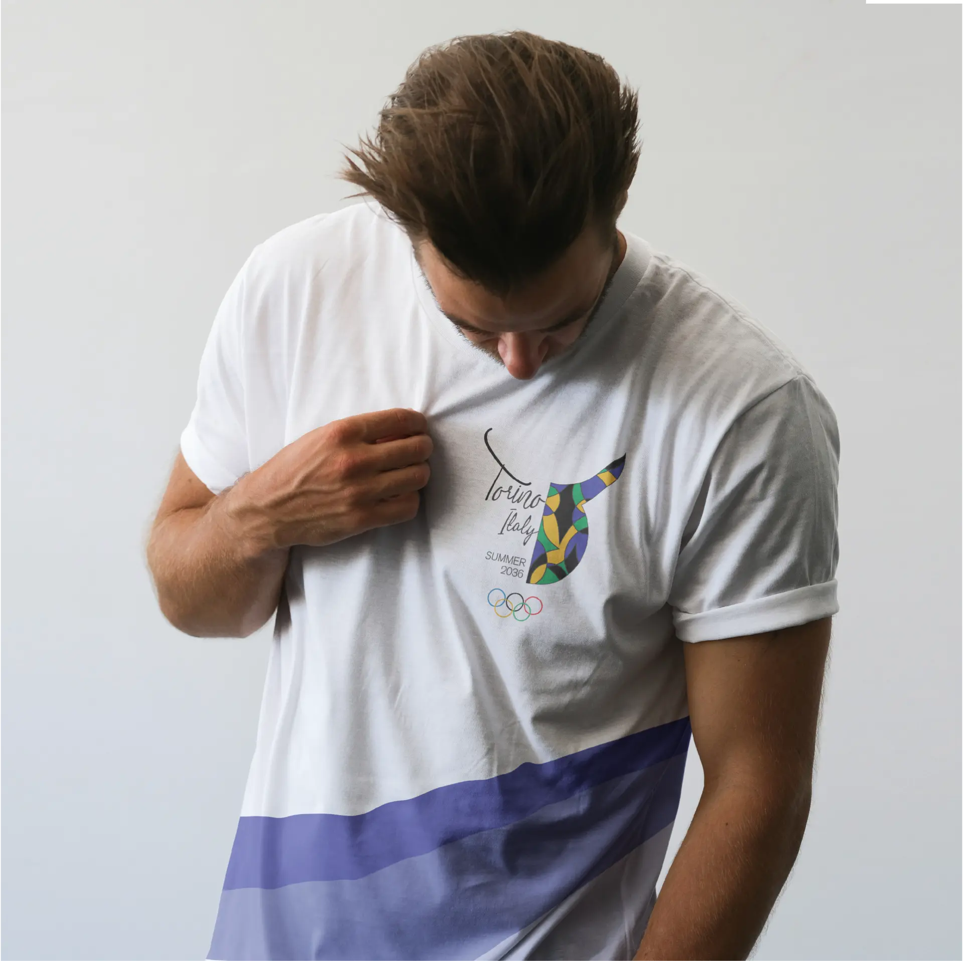
Torino, Italy Olympics
Designing a modern Olympic identity inspired by Torino's history, architecture, and cultural symbolism.
Brand Identity · Event Branding · Environmental Graphics
Project Overview
Overview
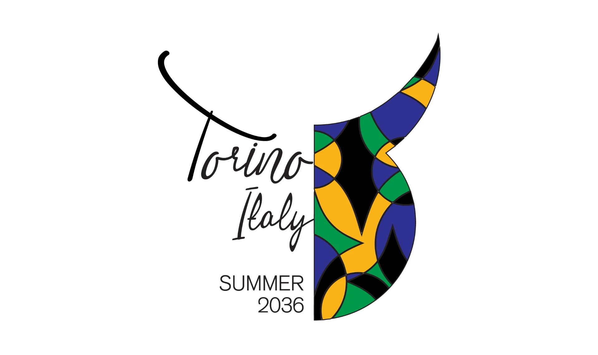
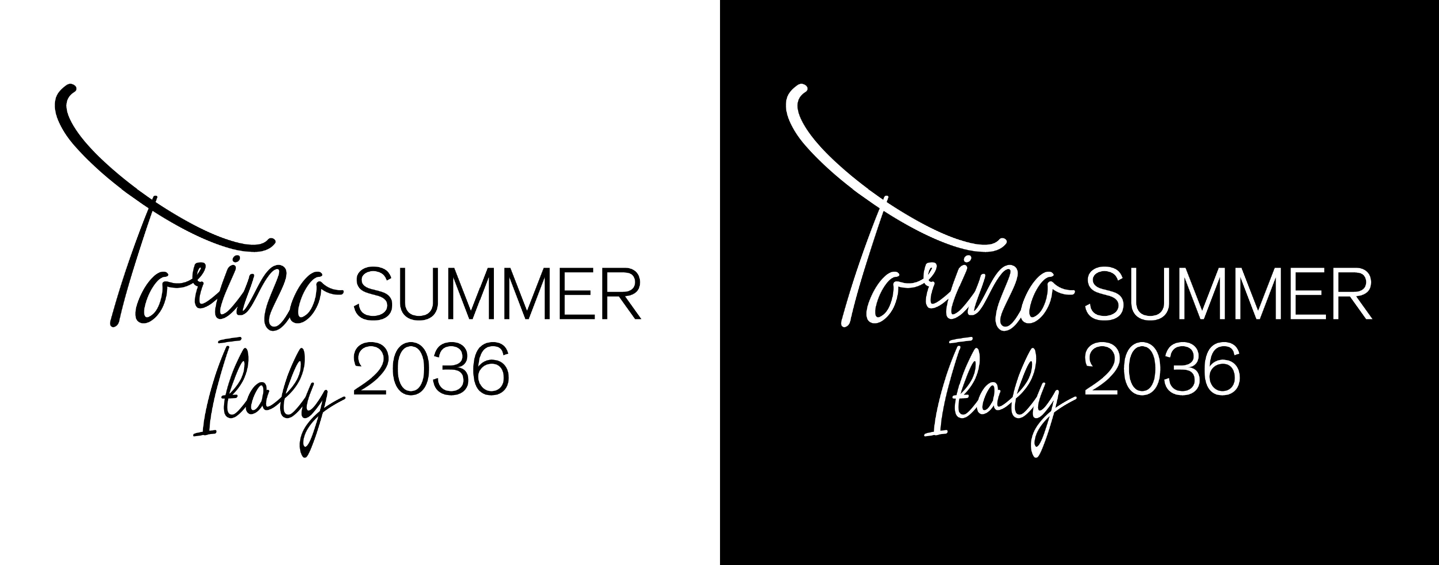
This project explores a visual identity for the 2036 Summer Olympics hosted in Torino, Italy. My goal was to create a brand that celebrated Torino's rich history while feeling bold enough to represent an international sporting event. Rather than relying on familiar Italian imagery, I wanted the identity to reflect the city's architecture, mythology, and symbolism, creating a brand system that felt unique to Torino and memorable on the world stage.
The Challenge
The Brief
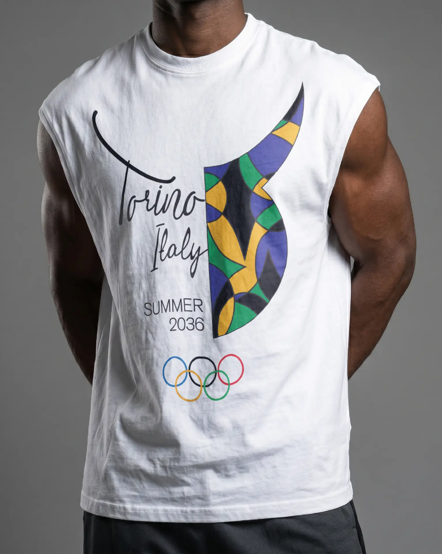
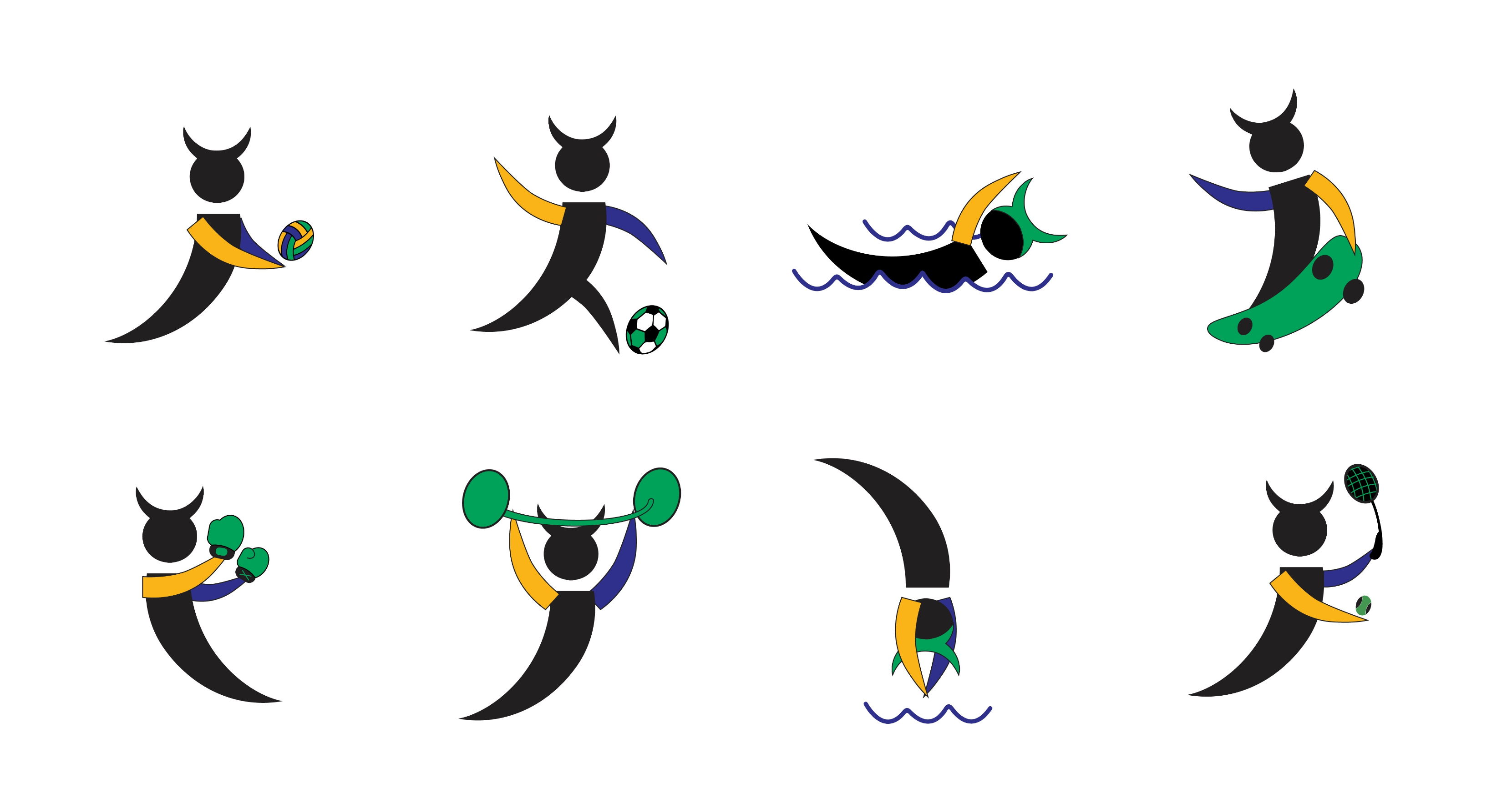
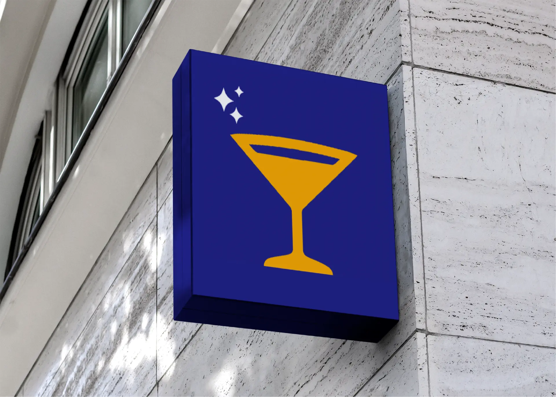
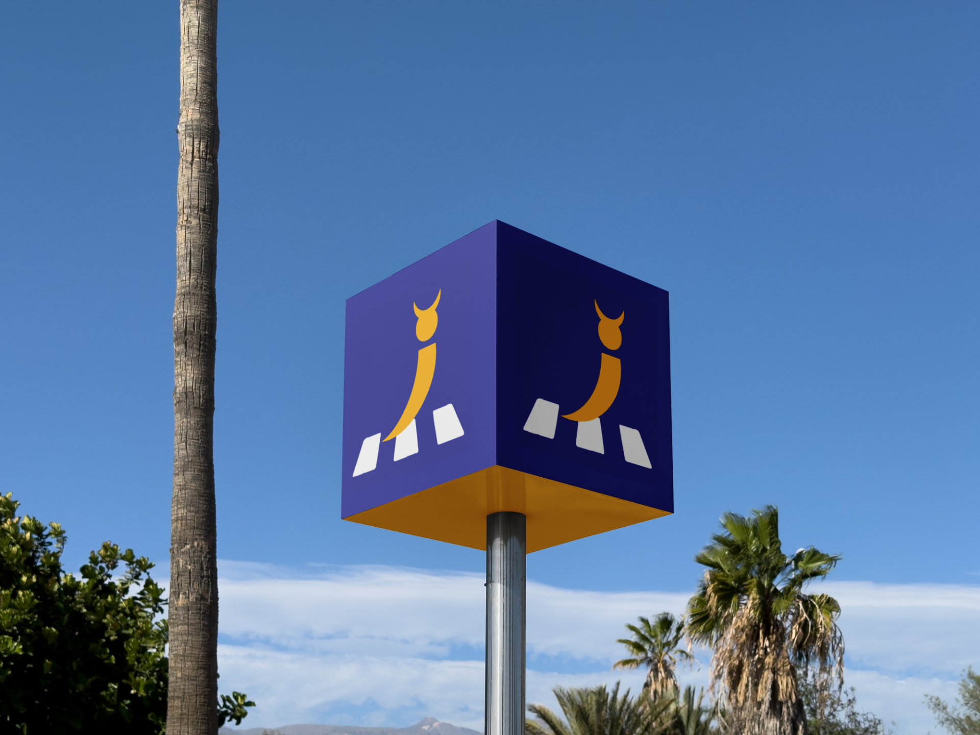
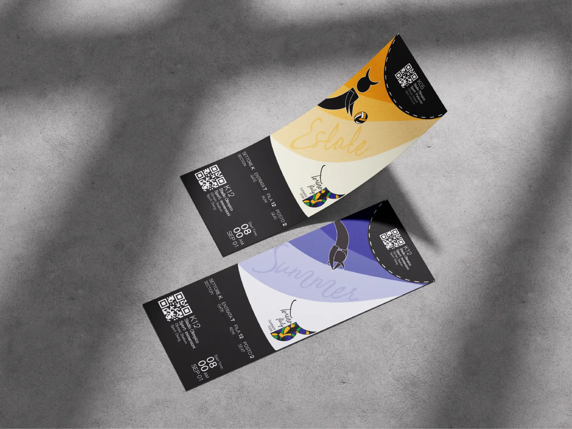
The objective was to design a complete branding system for a fictional 2036 Summer Olympic Games host city. The project included developing an Olympic logo, a set of sport icons, event tickets, accreditation badges, signage, apparel, and supporting brand applications. Every element needed to work together as one cohesive identity while representing the culture and character of Torino.
Goals
My goal was to create a brand that felt both modern and deeply connected to Torino's history. Through research, I discovered the city's ties to architecture, alchemy, mythology, and the symbolism of the bull, all of which became the foundation for the visual language. I wanted every application to feel consistent while capturing the excitement of the Olympics and the cultural identity of the host city.
Brand Direction
Identity
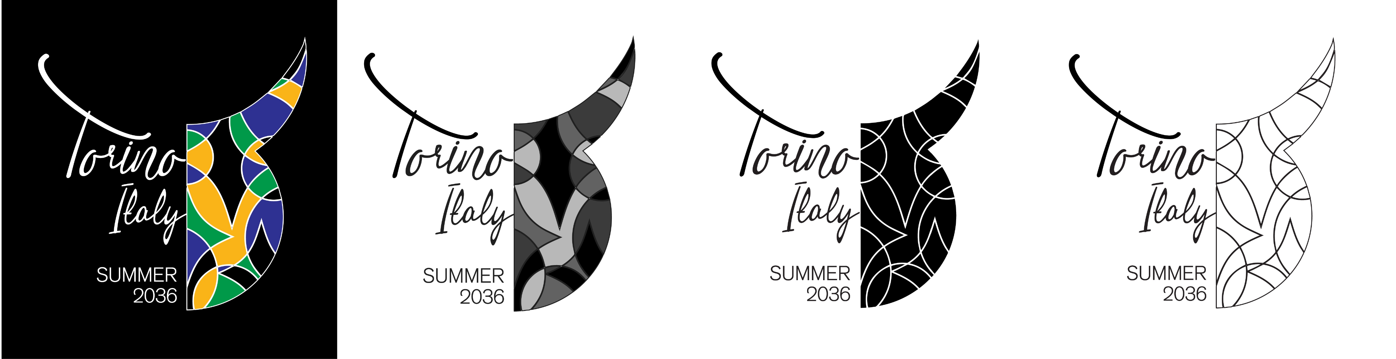
The identity is built around the idea of duality, a concept that appears throughout Torino's history and mythology. I combined geometric forms inspired by cathedral architecture with layered circles and diamond shapes to create a visual language that feels ornate, balanced, and energetic. The bull, a long-standing symbol of Torino, became an important influence throughout identity and helped establish a recognizable system across every deliverable.
Visual System
Color
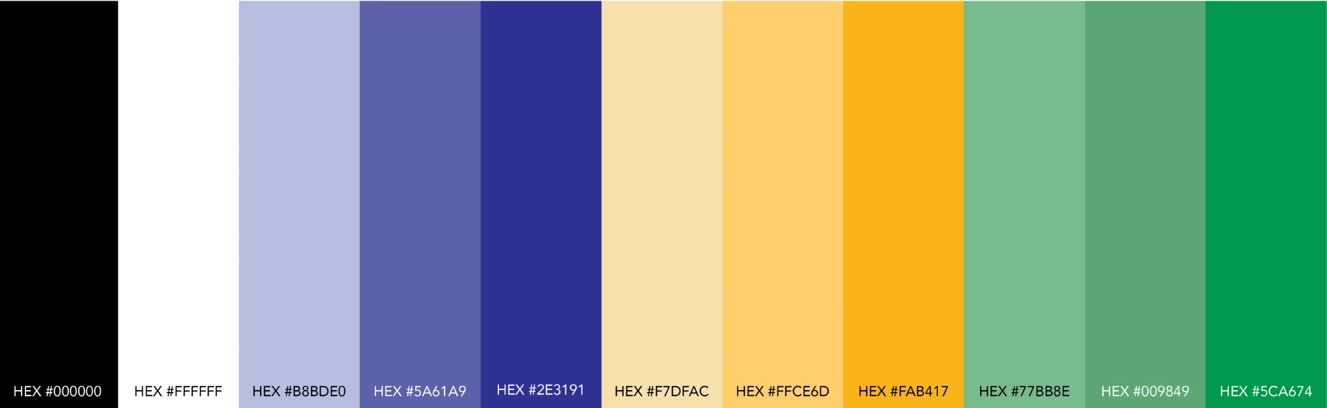
The color palette was inspired by the flag of Torino while introducing green as a reference to the Taurus zodiac sign and its connection to the city. The combination creates a strong contrast that feels vibrant and ceremonial while remaining distinctive among traditional Olympic branding. Together, the colors reinforce the cultural inspiration behind the identity while providing consistency across every application.
Typography
I selected typography that complements the geometric structure of the identity without competing with it. Clean letterforms create clarity across signage and event materials while allowing the logo and supporting graphics to remain the primary focus. The result is a visual hierarchy that feels modern, readable, and appropriate for an international event.
Applications
Brand in Action


Reflection
Outcome
This project challenged me to create an identity system that balanced cultural storytelling with the demands of a large international event. Every design decision was guided by my research into Torino's architecture, mythology, and symbolism, allowing the final brand to feel authentic rather than generic. The completed system works consistently across logos, icons, signage, apparel, and event materials while presenting a modern Olympic identity that celebrates the unique character of Torino.