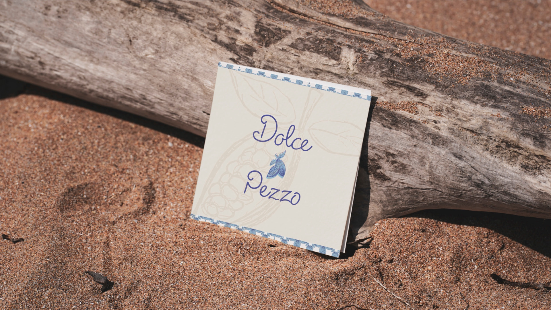
Dolce Pezzo
Crafting an Italian-inspired chocolate brand that celebrates connection, craftsmanship, and the joy of slowing down.
Brand Identity · Packaging Design · Product Branding
Project Overview
Overview
Dolce Pezzo is a conceptual chocolate brand inspired by the culture, craftsmanship, and atmosphere of Italy. My goal was to create more than just a premium chocolate brand. I wanted to design an experience that captured the emotions people associate with Italy, including peace, connection, warmth, and slowing down to appreciate life's simple moments. The brand includes three chocolate bar flavors and a hot cocoa mix, all designed to feel handcrafted, welcoming, and culturally inspired.
The Objective
The Brief
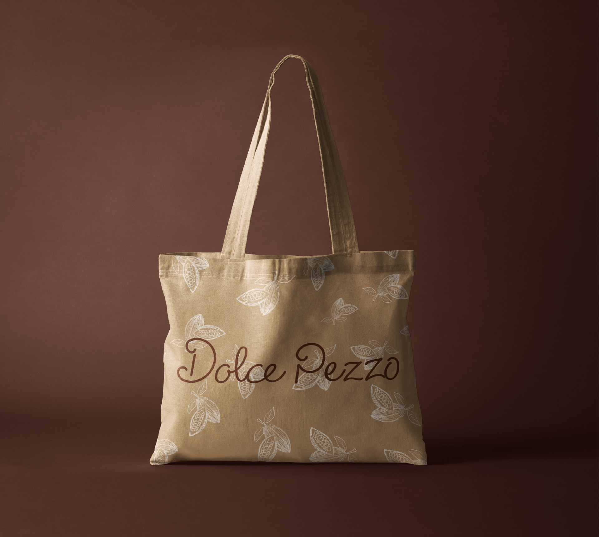
The objective was to create a complete brand identity for a chocolate company inspired by a chosen culture. I developed a cohesive visual system that included a logo family, packaging, supporting graphics, and branded merchandise. Every element was designed to communicate the values of Italian craftsmanship while creating a memorable and emotionally driven experience for the consumer.
Research
Mood
Research
Cultural Inspiration
Direction
Goals
From the beginning, I wanted the brand to evoke a feeling rather than simply sell a product. My goal was to create a visual identity that encourages people to slow down, appreciate meaningful moments, and enjoy chocolate as an experience. I also wanted the identity to feel timeless and adaptable so it could grow beyond its initial product line.
Brand System
Identity
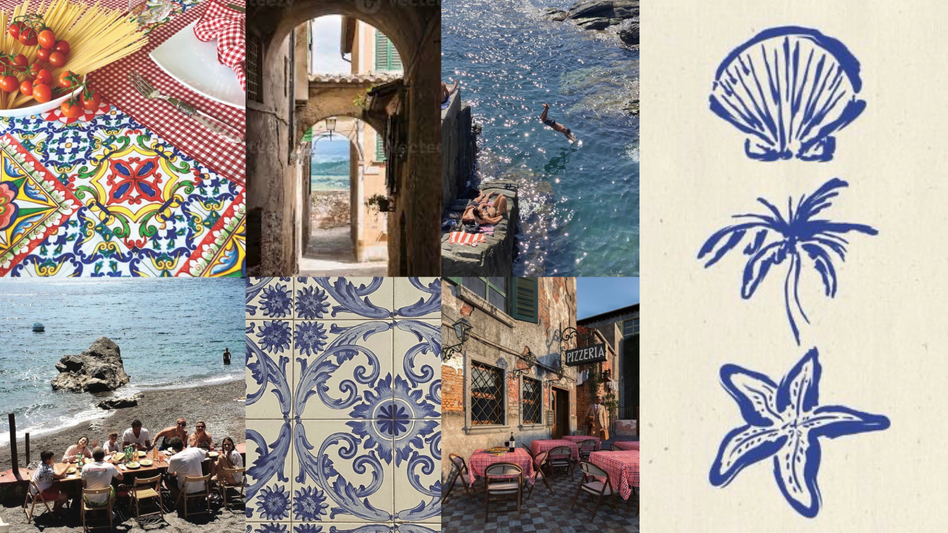
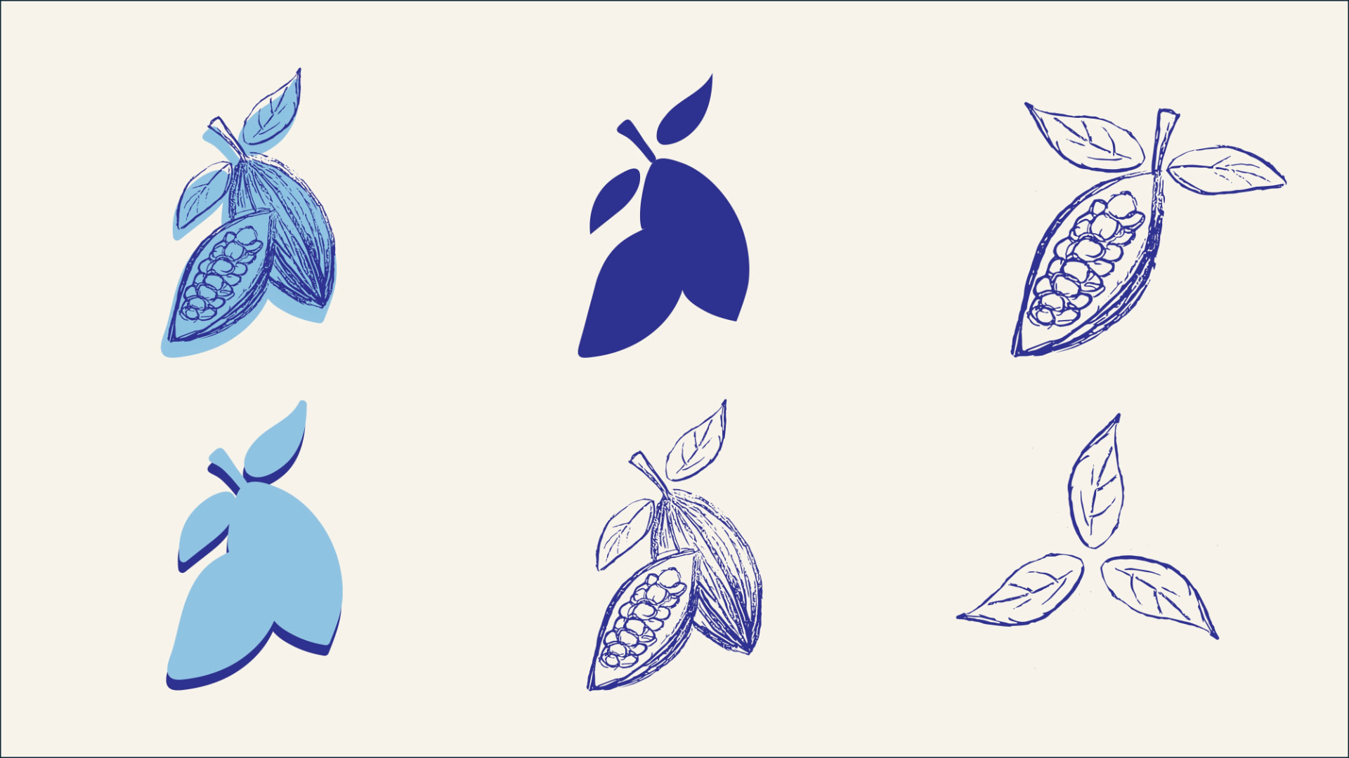
The identity is centered around the ideas of peace, unity, flow, and craftsmanship. I drew inspiration from Italian architecture, decorative details, and the country's emphasis on connection and hospitality. Soft curves, open compositions, and flowing forms create a visual language that feels calm, welcoming, and authentic while supporting the handcrafted nature of the brand.
Brand Values
Mission Statement
Dolce Pezzo's mission is to craft chocolate that inspires peace, unity, and genuine connection. Our brand is made for moments of personal Zen as well as shared experiences that bring people together. We believe in nurturing both self-connection and community, creating treats that offer comfort, joy, and belonging. No matter who you are, there's something at Dolce Pezzo made just for you.
Who It's For
Audience
Dolce Pezzo is crafted for mindful, connection driven individuals who value comfort, meaningful moments, and small everyday luxuries. The audience includes people seeking personal calm, those who cherish shared experiences, and anyone who appreciates thoughtful, quality treats that bring a sense of peace and belonging.
Visual System
Color
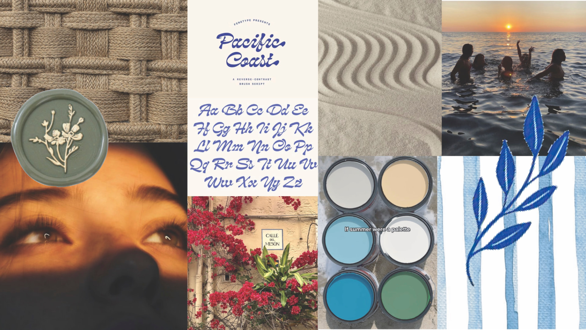
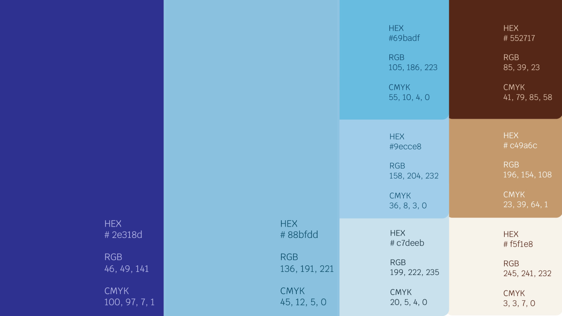
I built the color palette around the atmosphere of Italy. The cool blues reflect open skies, coastal landscapes, and a sense of tranquility, while the warm browns and creams connect back to chocolate, handcrafted materials, and natural textures. Together, these colors create a balance between freshness and warmth while giving the packaging a premium yet approachable feel.
Visual System
Typography
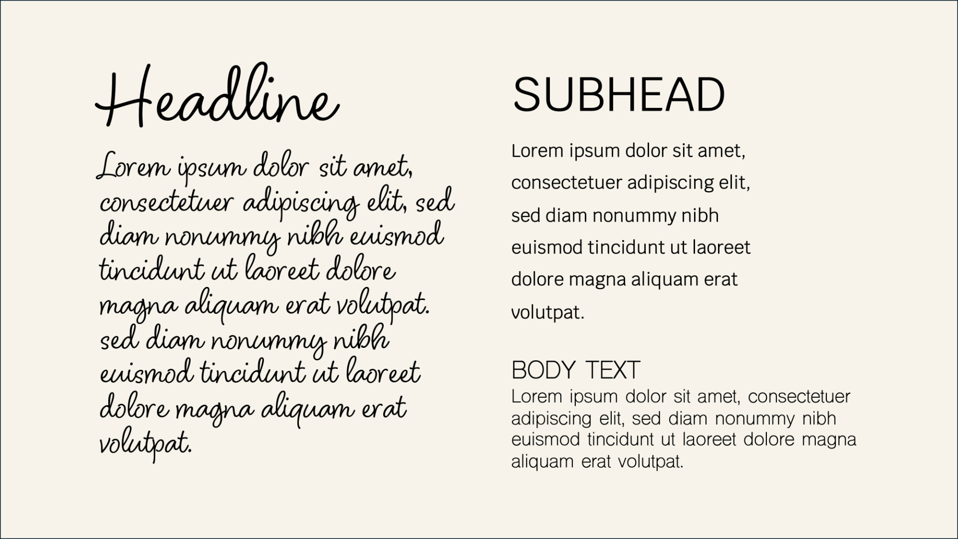
Typography became one of the strongest expressions of the brand's personality. I chose elegant, flowing letterforms that feel handcrafted while maintaining readability across the entire identity system. Pairing expressive display typography with a clean supporting typeface creates a visual hierarchy that feels sophisticated, approachable, and timeless.
Applications
Package Design
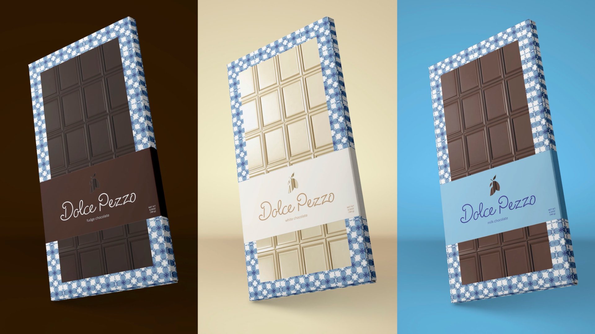
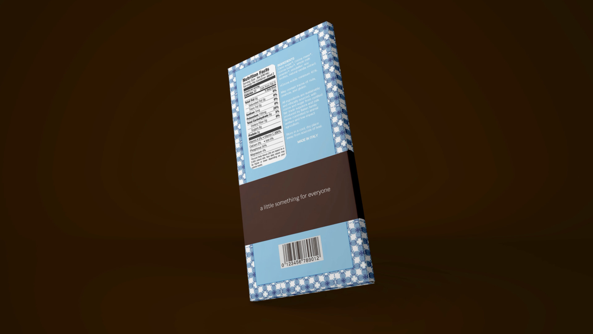
The packaging was designed to feel open, calming, and inviting. I used generous negative space, layered blue tones, and flowing graphic elements to create a sense of airiness that reflects the brand's emotional values. Each product shares a consistent layout while using subtle variations to distinguish the different flavors, creating a cohesive family of products.
Fudge Chocolate — White Chocolate — Milk Chocolate
Applications
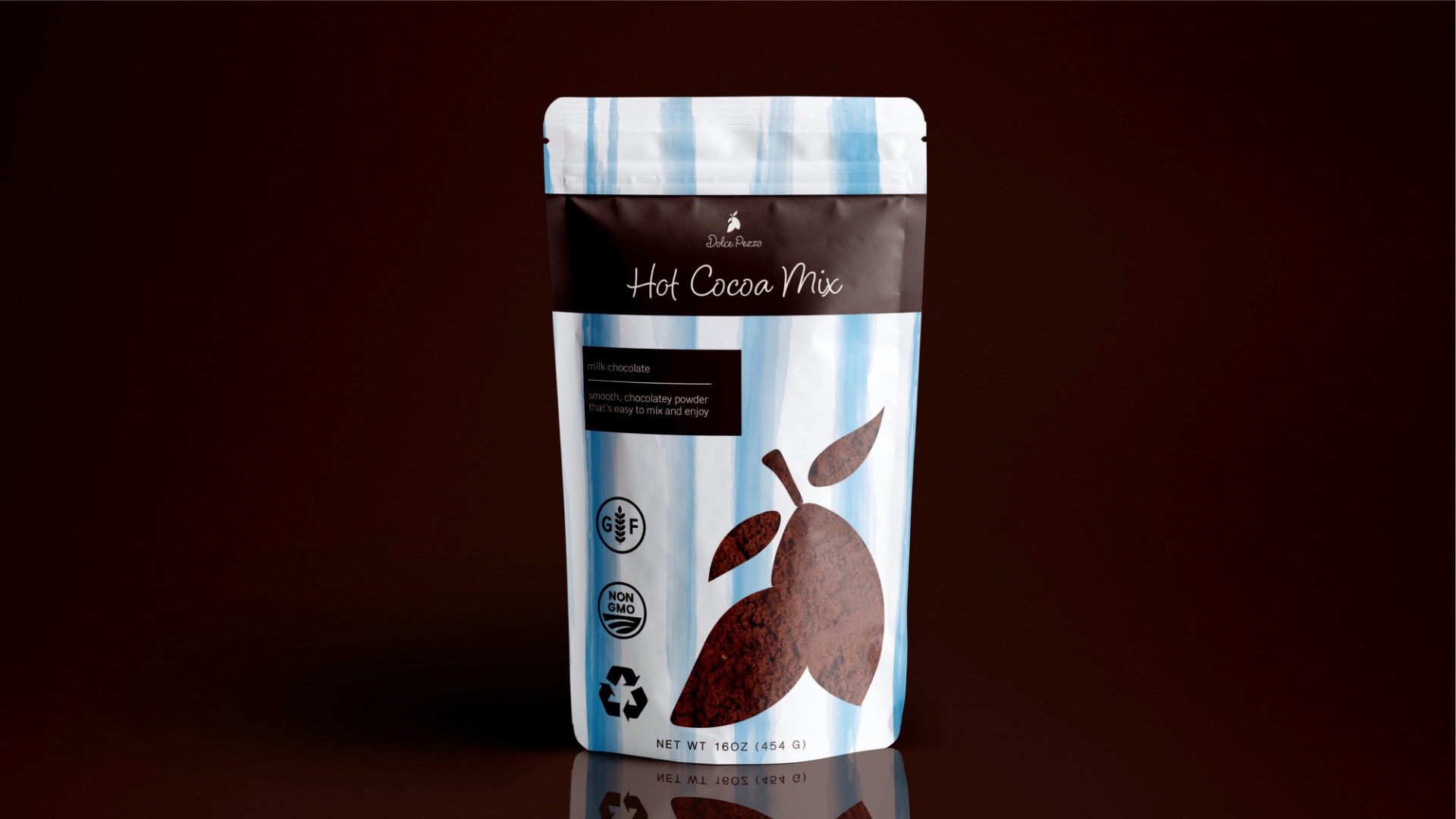
Hot Cocoa
Reflection
Outcome
This project challenged me to create a brand that communicates emotion through design rather than relying only on visuals. Every decision, from the flowing typography to the calming color palette and open layouts, was guided by the goal of translating the warmth and craftsmanship of Italian culture into a memorable brand experience. The final identity captures a sense of peace, connection, and authenticity while creating a flexible system that can continue to grow across future products and applications.
Merchandise
Beach Bag
Collateral
Business Card