BOO
A playful identity for healthier Halloween treats.
Brand Identity · Packaging Design
Project Overview
Overview
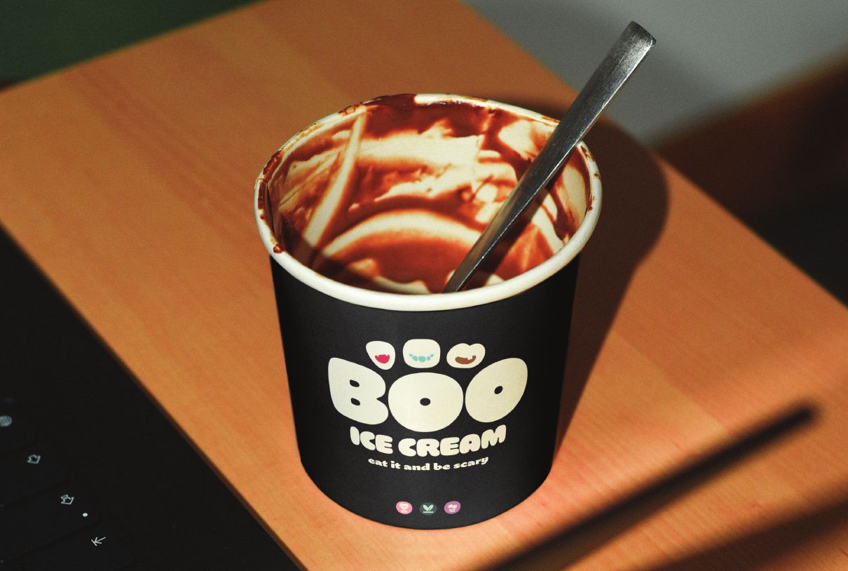
Boo is a conceptual brand created for a line of vegan, sugar-free Halloween sweets designed for children. The objective was to develop a visual identity that captures the excitement of Halloween while communicating a healthier alternative that parents can trust. The final system balances playful illustrations, bold typography, and seasonal colors to create an identity that feels both fun and approachable.
The Challenge
The Brief
Design a logo and packaging system for a children's Halloween candy brand that feels playful, spooky, and approachable while emphasizing its vegan and sugar-free ingredients.
Goals
- Create a memorable Halloween identity
- Appeal to children ages 5–12
- Build trust with parents
- Develop a packaging system adaptable across multiple flavors
Brand Direction
Identity
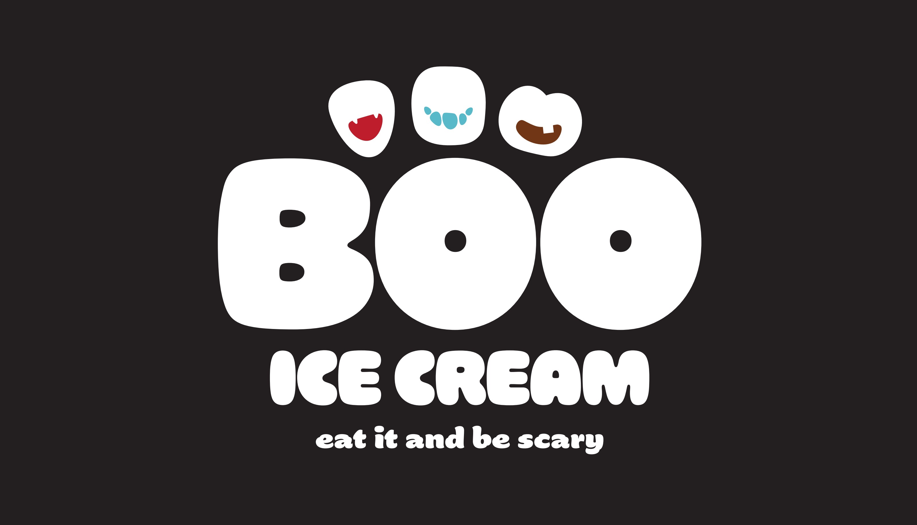
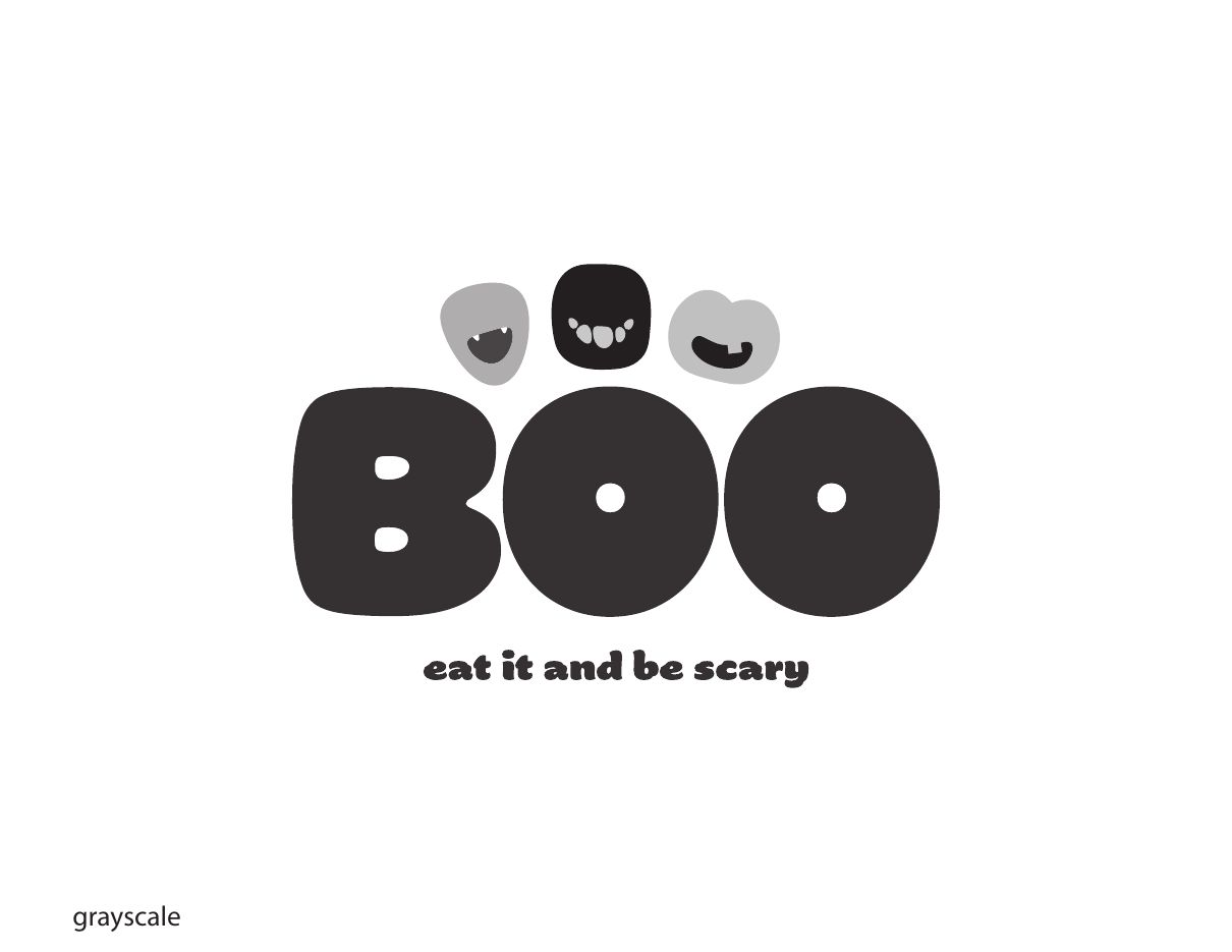
The Boo identity was designed around soft, rounded typography that feels friendly rather than frightening. The bold letterforms create a playful personality while remaining highly recognizable across packaging and future brand applications.
Visual System
Color
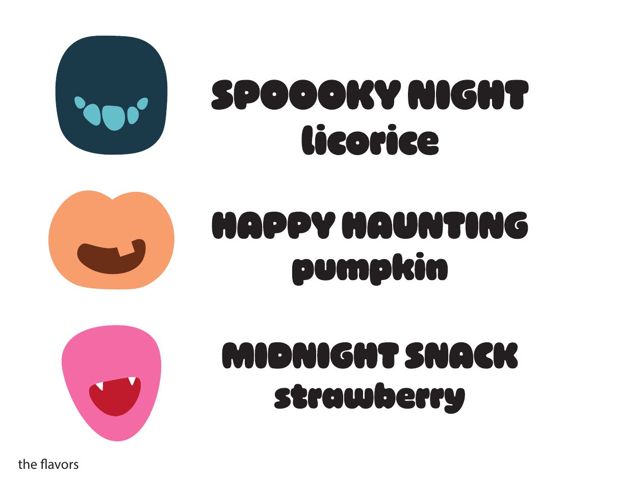
A vibrant Halloween-inspired palette creates strong shelf presence while allowing each product flavor to maintain its own personality.
Typography
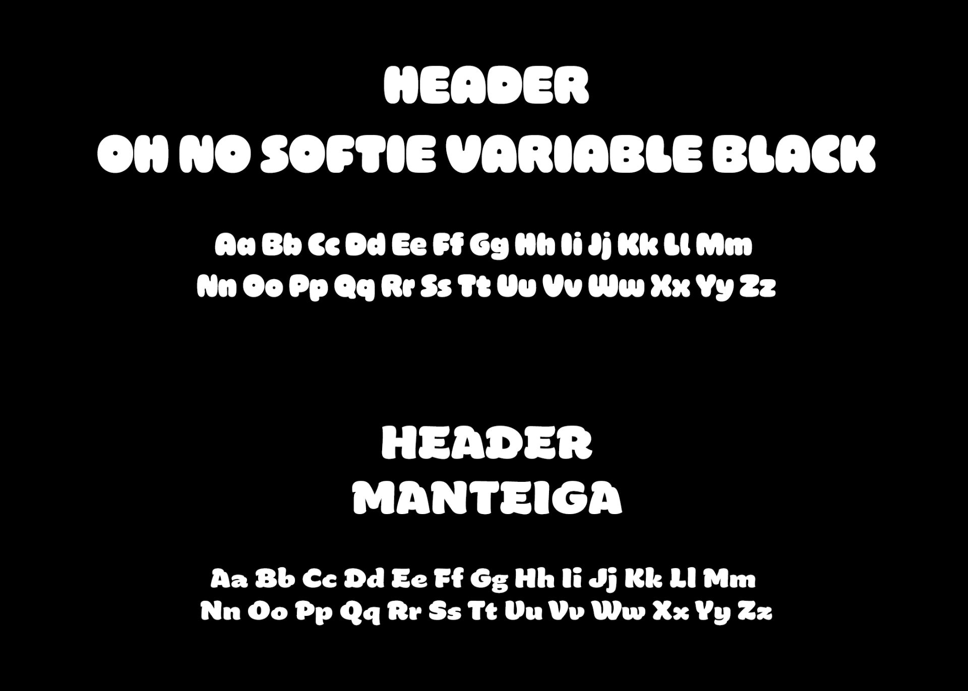
Rounded display typography reinforces the playful tone, while a clean secondary typeface supports readability across packaging and brand communications.
Icons
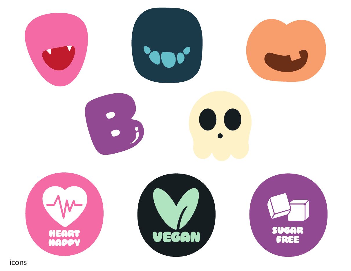
Simple icons communicate key product benefits, including vegan and sugar-free ingredients, while adding personality throughout the packaging system.
Packaging System
Packaging
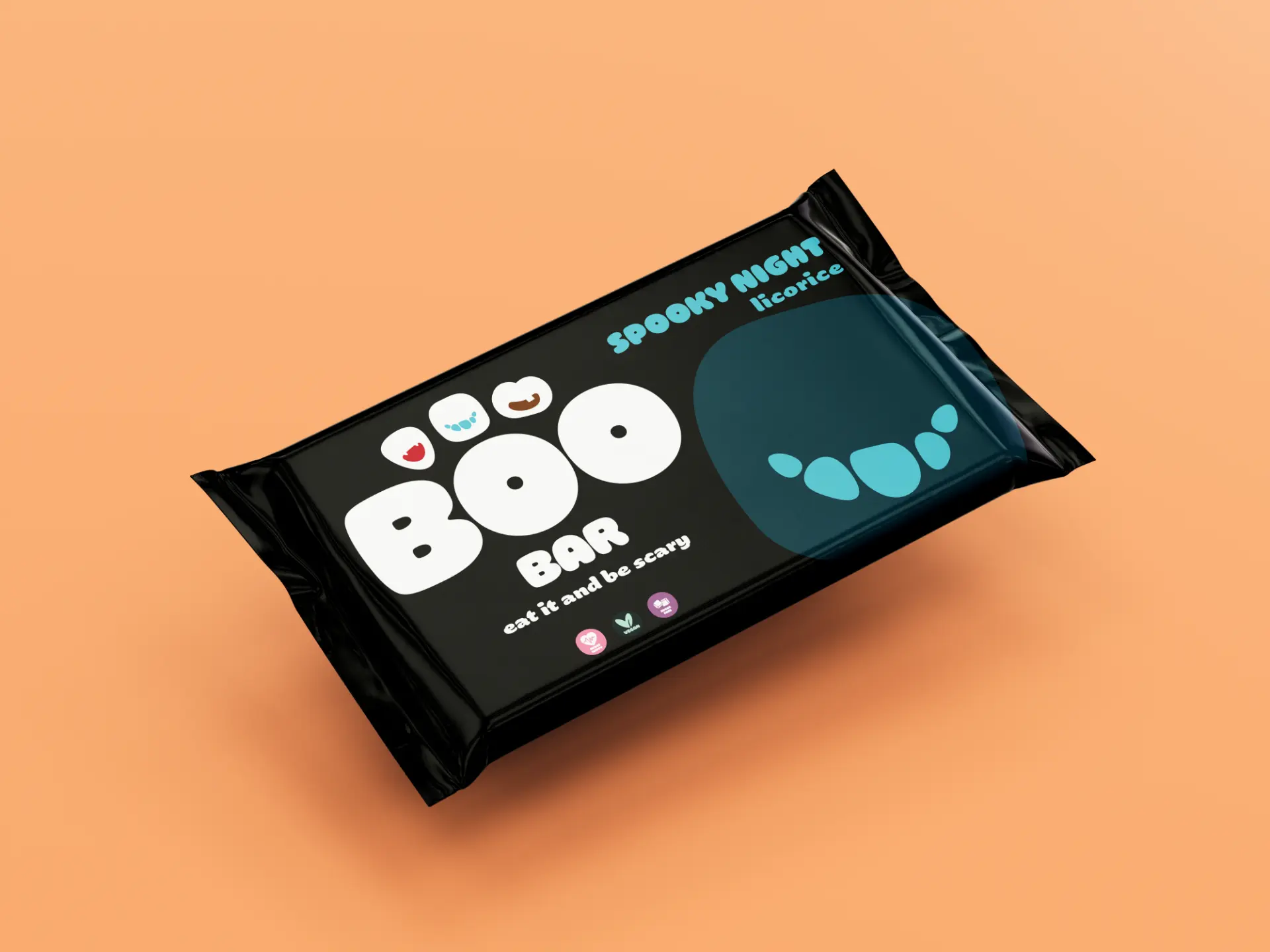
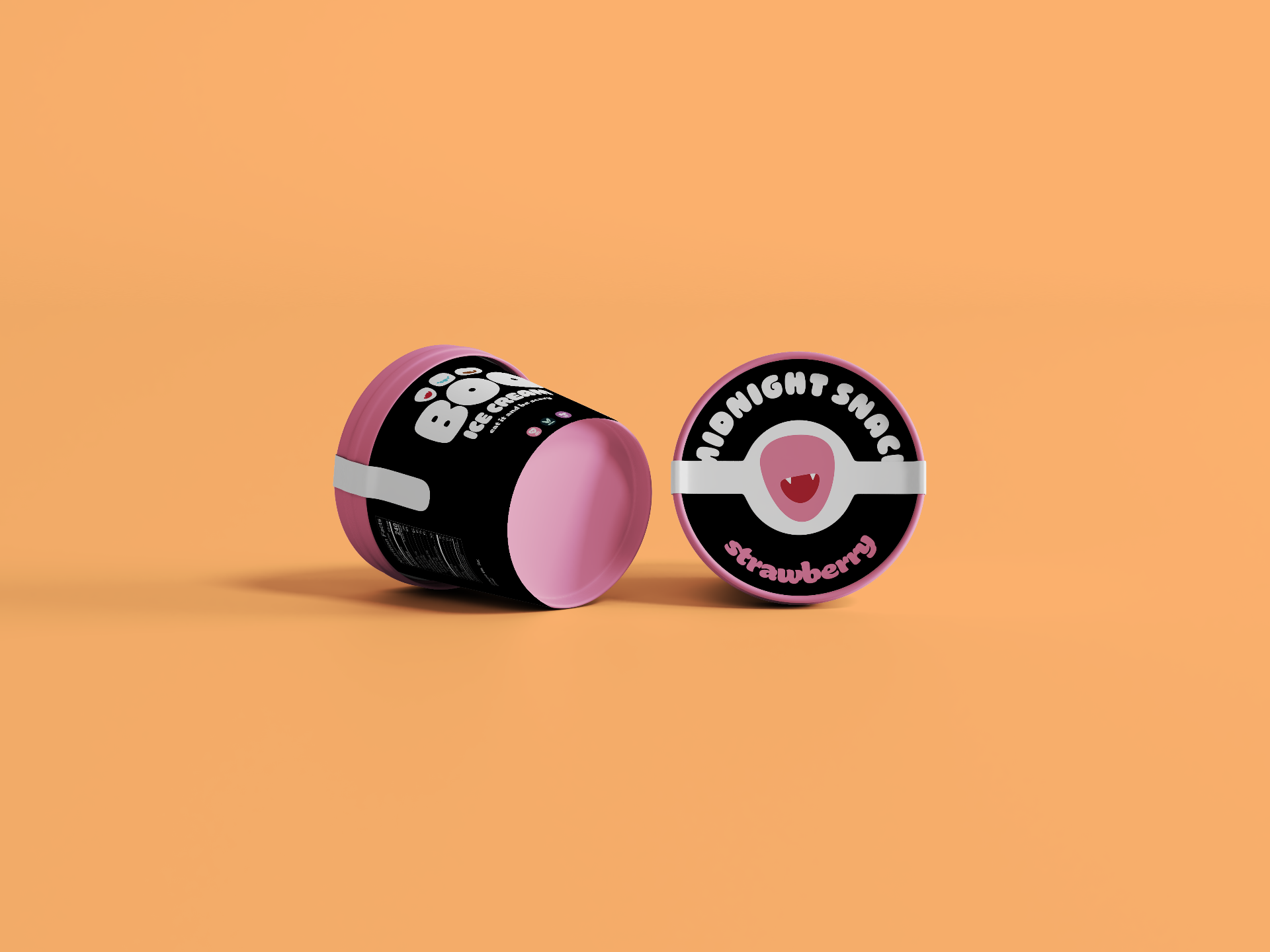
The packaging uses a consistent layout that allows each flavor to be immediately recognizable through color while maintaining a cohesive brand identity. Friendly Halloween graphics create excitement for children without relying on traditional horror imagery.
Reflection
Outcome
This project challenged me to design for two audiences at once: children, who are drawn to playful visuals and Halloween themes, and parents, who value healthier ingredients and trustworthy branding. By balancing these needs, I created a brand identity that is both engaging and scalable across future products.